
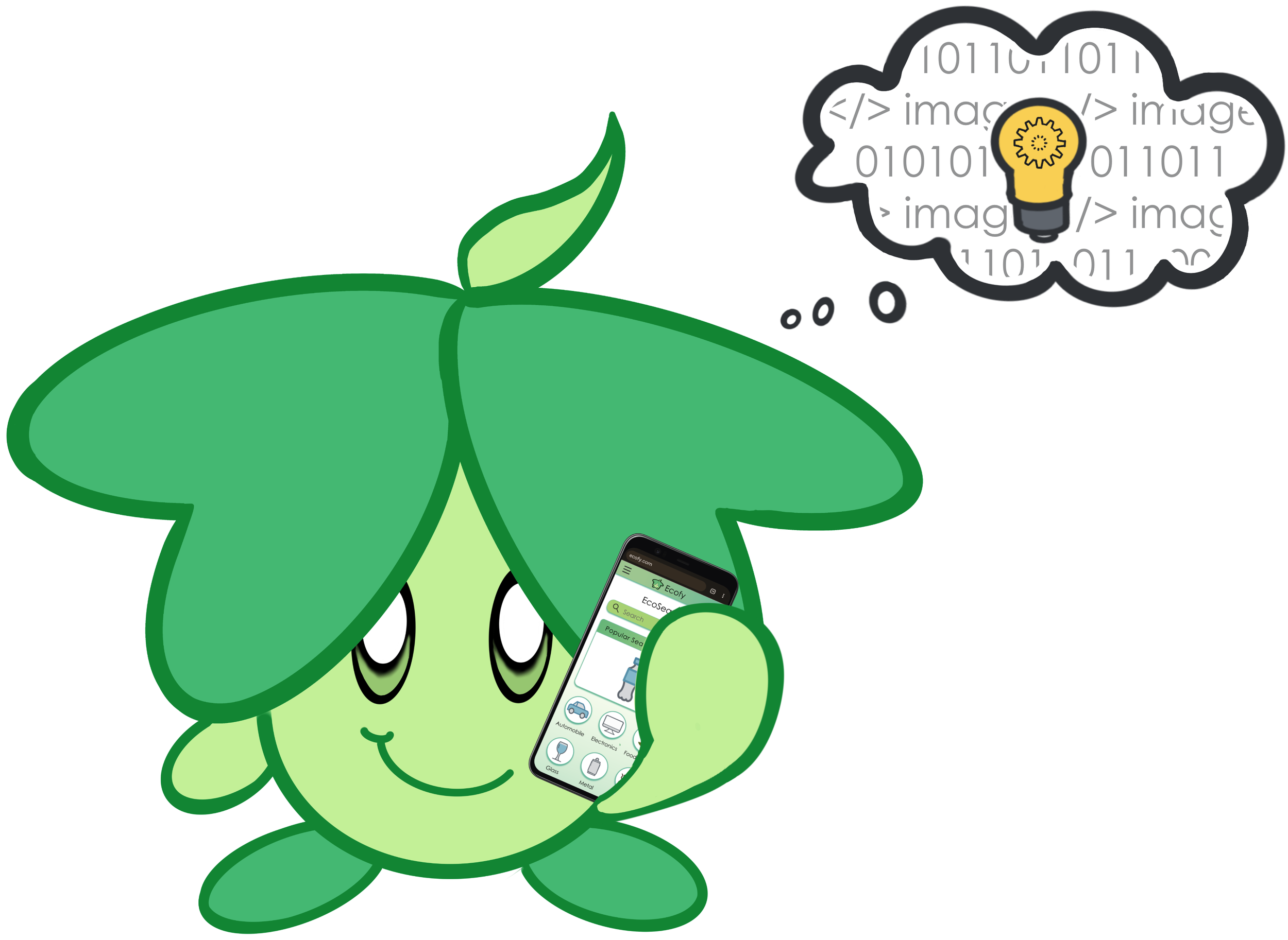
(verb) To make something eco-friendly
The eco-friendly website that makes being eco-friendly informative and rewarding
⇩
Project Overview:
Motivated by our passion for the environment, Ecofy was founded as a result of our personal struggles to adopt eco-friendly behaviors. We weren't aware of our ecological footprint, struggled to find easy and comprehensive tutorials, and weren't rewarded for our efforts. Importantly, no website fulfilled our needs.
After multiple revisions, Ecofy was born.
My Role
UX Researcher
UX Designer
UI Designer
Tools
Duration
10 Months
Part-Time

Problem Space
Our everyday lifestyle is partly responsible for climate change. People want to b “ecofy” their daily lifestyle, yet face the following challenges.
Lack of awareness of the positive and negative impacts of their everyday behaviour on the environment.
Lack of knowledge due to the difficulty identifying items and finding easy and comprehensive tips for eco-friendly alternatives.
Lack of positive reinforcement that recognizes their efforts and makes being eco-friendly fun.
Solution
Design a responsive website that brings awareness, educates, and rewards users for “ecofying” their lifestyle. Ecofy makes being eco-friendly enjoyable, easy, and efficient. Key features to support users in being eco-friendly:
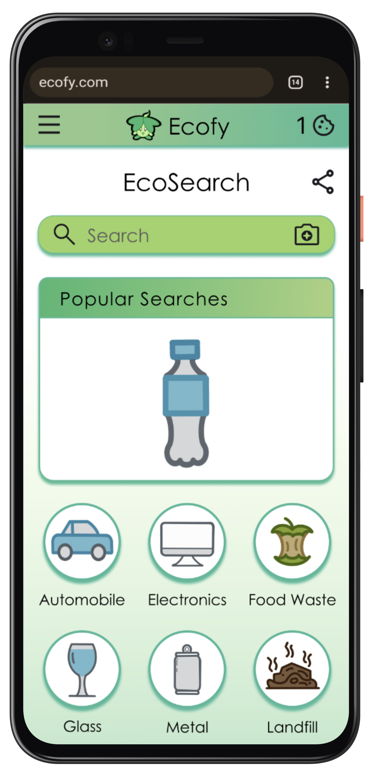
Search & Scan

Users can scan to search for items. They can sort/filter an easy and comprehensive list of eco-friendly alternatives based on their needs.
Eco-Calculator
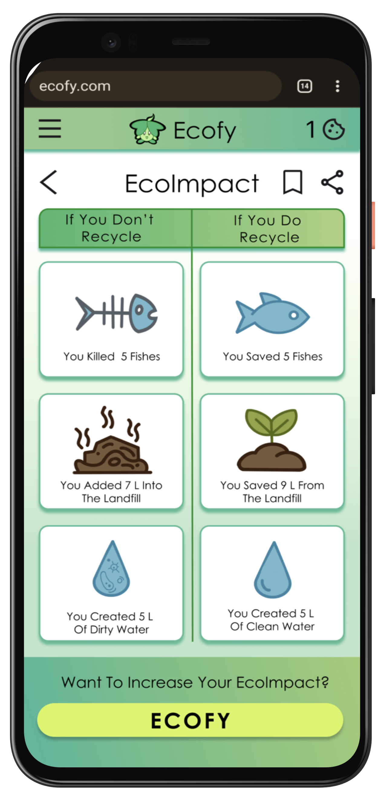
Showcases the positive and negative of their everyday behaviour and consumption, and the accumulative result on the environment.
Fun Rewards
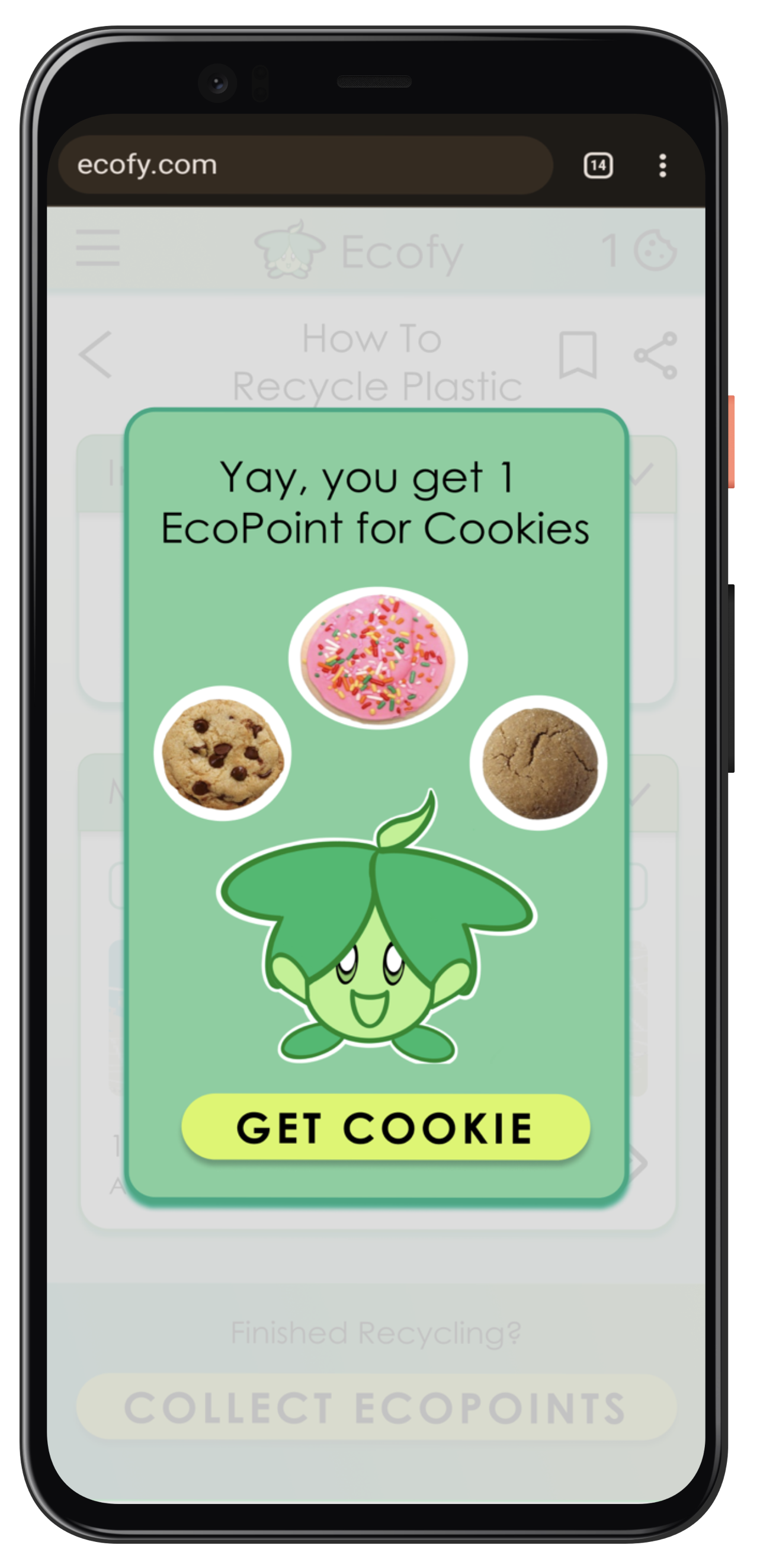
Rewards efforts by providing points that can be redeemed for cookies.
Click It
Below is my journey of designing a product that met my user expectation. If you can’t wait and want to head straight to the excellent part…
Lean & User Centered Design
I combined Lean Design and User-Centered Design to build a prototype that rapidly fulfilled my user's needs. Centering the user in the process, I researched, conceptualized, and made a product to reflect them. Following the Lean Design, I quickly sketched multiple ideas, filtered them, and tested the best hypothesis with real users to validate and reiterated them to refine my ideas.
Discovery
Competitive Analysis
User Survey & Interview
User Personas
Problem Statement
User Journey
Figure out who the users are:
Concepting
User Flows
Information Architecture
Card Sorting
Low Fidelity Wireframe
Mid Fidelity Wireframe
Brainstorm the best solution:

Testing
Usability Testing
Affinity Map
Issues & Resolution
Pain Point Prioritization
Preference Testing
Test, assess & revise issues:
UI Design
Visual Principles
Emotional Designs
High Fidelity Prototype
Style Guide
Design UI to increase usability:
Reflections
Highlights
Improvements
Growth opportunities:
Part 1: Discovery
I discovered how my competitors approached meeting user expectations and the advantages and shortcomings of the existing platforms. That resulted in understanding the gap in the market that my website could fill.
To discover who my users are and their eco-friendly needs, I applied research methods, such as user surveys and user interviews. I focused on finding what behaviour patterns and motivations that help the users to become eco-friendly.
Competitors Analysis


My competitors include websites and apps that attract the same target audience and provide eco-friendly service. Comparing their Competitor Profiles, SWOT Analysis and UX Audit, I analyzed my competitors to understand how they helped or hindered the user in their eco-friendly journey, hoping to find gaps in the market that my app could meet.
Competitor Profiles
I reviewed all my competitors to know their business models and to set a benchmark of their offerings that users expect.
For the sake of brevity, I have showcased two of the most relevant websites/apps: 1) Recycle BC & 2) JouleBug


Swipe to see the other competitor
SWOT Analysis
After reviewing their competitor profiles, I conducted a SWOT Analysis to understand where to position my Ecofy in the market.


Swipe to see the other competitor
UX Analysis
To comprehend how the competitor’s UX design helps or hinders users, I conducted a UX Audit to gain inspiration for my UX design.


Swipe to see the other competitor
Key Insights
Market Gap:
Lack of cohesive tutorials: Features are scattered throughout the website and not organized on one accessible page.
Difficult to search: It is hard to locate the information because users struggle to identify the material they want to ecofy. Also, the competitors lack filters and sorting options.
Lack of Personalization: Articles provided stats or advice for the average person, not considering the user's unique needs.
Poor UX: Websites required extra steps to complete tasks, and had an inefficient navigation structure and unclear CTAs.

Users Survey
I conducted a user survey to learn who the user is and their problems. After I designed a quantitative survey, I posted it on social media groups (like Facebook and Reddit) consisting of my users. The survey had 20 participants.
The survey focused on one critical question:
What is hindering you from being eco-friendly?
Users Survey Results

Top 3 Reasons:
1) Lack of Awareness
2) Lack of Education
3) Lack of Incentive
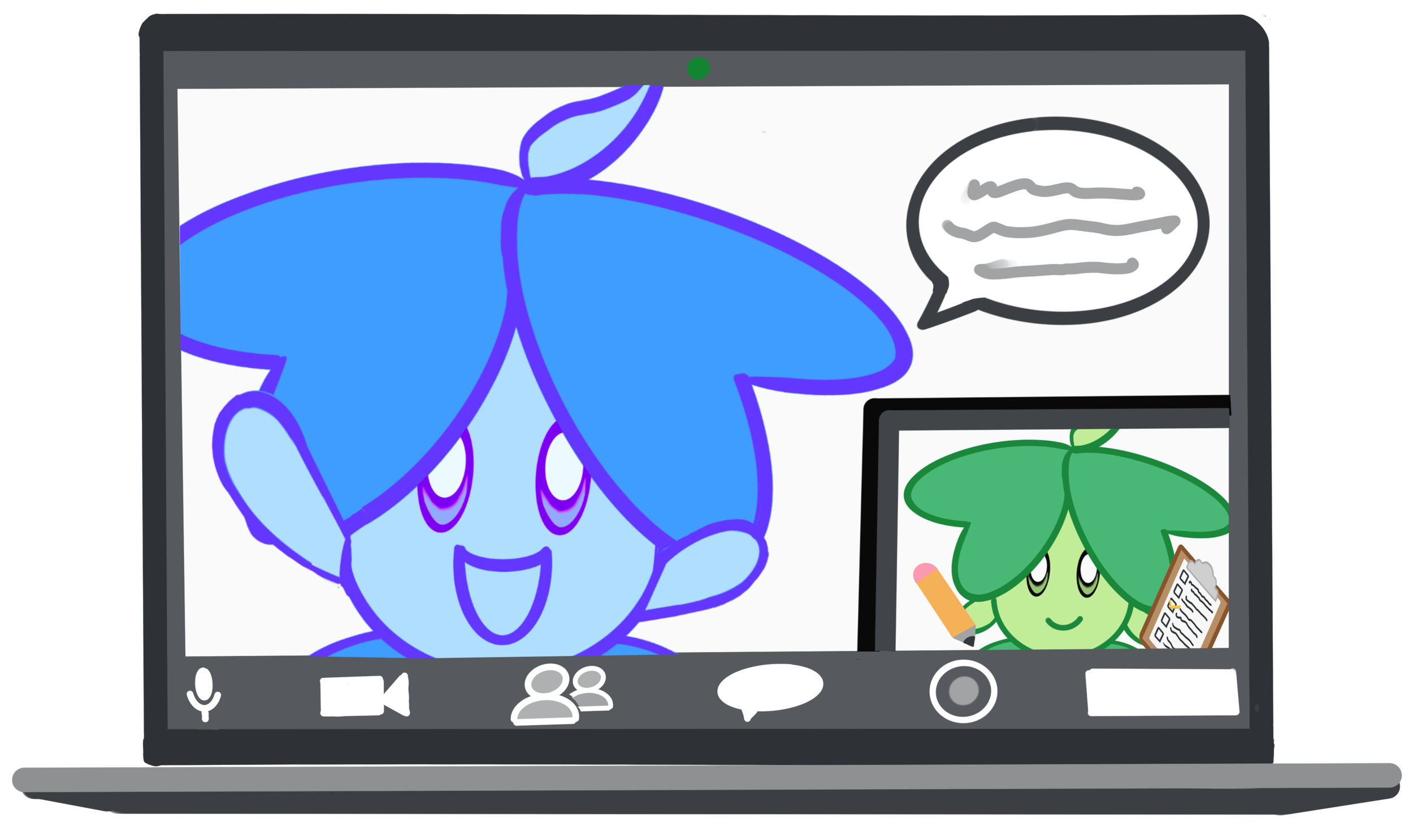
User Interviews
After conducting my User Survey, I wanted to dig deeper and unearth the WHY behind their frustration, motivation, and goals. Hence, I conducted User Interviews with five people over Zoom, and I focused on understanding the following objectives:
Identify the user’s current level of engagement and understanding of eco-friendly behaviour.
Identify the behaviour the participants want to change to become more eco-friendly.
Identify the incentives that excite the user to be eco-friendly.
Interview Results
60% of the participants know the eco-friendly basics. 40% of the participants were eco-friendly experts.
80% of the participants stated that they wanted to improve by being mindful of their consumption.
80% of the participants needed a cohesive platform consisting of easy and efficient eco-friendly tips
60% of the participants said they would like fun incentives to encourage them.
Survey & Interview Synthesis
Using Affinity Mapping, I synthesized the findings of the interview results. I clustered them into common groups of behaviours/attitudes, environment, needs/goals, and frustrations. With an overall picture, I spotted emerging themes of their barriers to being eco-friendly and possible solutions to help overcome them.
Furthermore, the size of the cluster allowed me to gauge their importance and prioritize the features that should be on my website.


Key Insights
Education: Users struggled to find eco-friendly information that is easy, efficient, and on one site. Users struggled to identify the item's components, discouraging them from adequately discarding them.
Awareness: Users wanted to improve on being mindful of their consumption and behaviour. They wanted to be aware of how the item was made and how it will be discarded. Users wanted to compare the impact they make if they are eco-friendly vs when they are not.
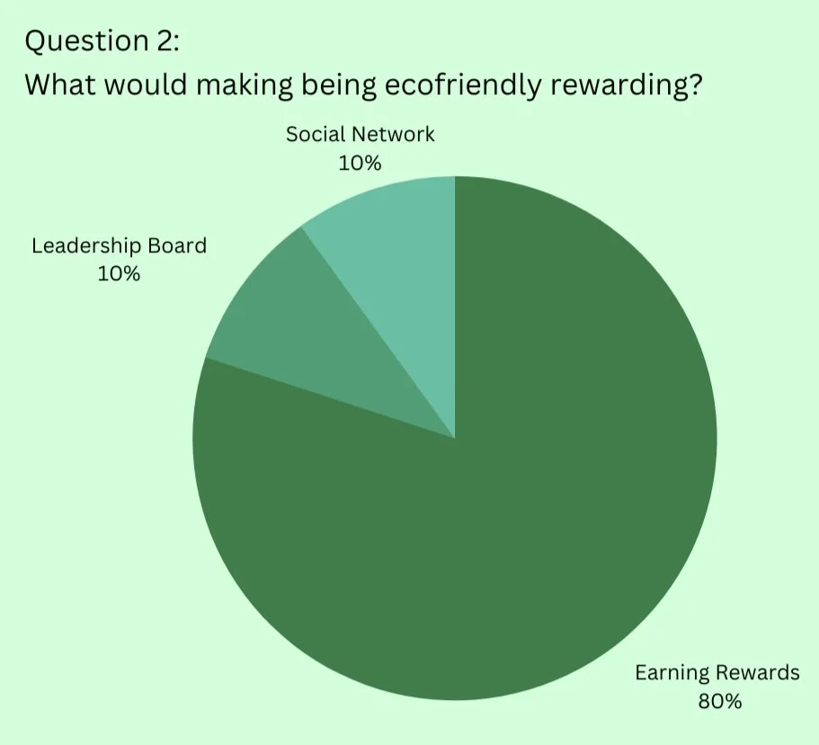
Rewards: Users were motivated by intrinsic values. However, they stated that earning rewards would be a bonus.
Engagement: Users varied in their eco-friendly dedication and knowledge, which meant they had different needs. Some users were passionate eco-warriors, but others tried to be decent citizens.
Fun: Users wanted eco-friendly activities to be lighthearted and enjoyable rather than a chore.
User Profiles
After analyzing the user survey and user interviews, two user personas emerged. These user personas consist of diverse pain points and goals, requiring Ecofy to design a website that accommodates that.
![4[1].png](https://images.squarespace-cdn.com/content/v1/6341fcc6158b89159333a325/ca186ab8-9962-4263-b249-7fc84dcb2858/4%5B1%5D.png)
![3[1].png](https://images.squarespace-cdn.com/content/v1/6341fcc6158b89159333a325/f715078a-631c-4ccc-afb6-719f2054543c/3%5B1%5D.png)
Swipe to see the other user profile
Problem Statement
People who want to increase their eco-friendliness need an easy way to be aware of their impact when making choices, the education to learn eco-friendly behaviours, and the incentive to reinforce their efforts.
We will know this to be true when the number of eco-friendly behaviours increases, measured by the rewards they earn.
User Journey Maps
To picture how both personas would interact with the features in typical everyday scenarios, I laid out user journey maps to understand their thought processes and emotional experience. Then, I designed elements according to their flow of action as they completed tasks.


Swipe to see the other user journey map
Key Insights
User Stories are crucial in summarizing who the users are and their vital functional requirements. Below are stories inspired by real-life conversations when they expressed their struggles and motivations:

Hippie Dippy
“I want to understand the ripple effects of my consumption and items, so that I can make informed choices and better protect the environment.”
Functional Requirements:
Way to compare their impact if they do or don’t behave ecofriendly.
Way to track and calculate their ecological footprint.

Aspiring Eco
“I want an easy and fun way to be eco-friendly, so that I can balance my busy life while enjoying doing small eco-friendly deeds”
Functional Requirements:
Easy way to identify the unknown material.
Easy way to find and sort search results of eco-friendly information.
Brief overview of product info.
Extrinsic rewards
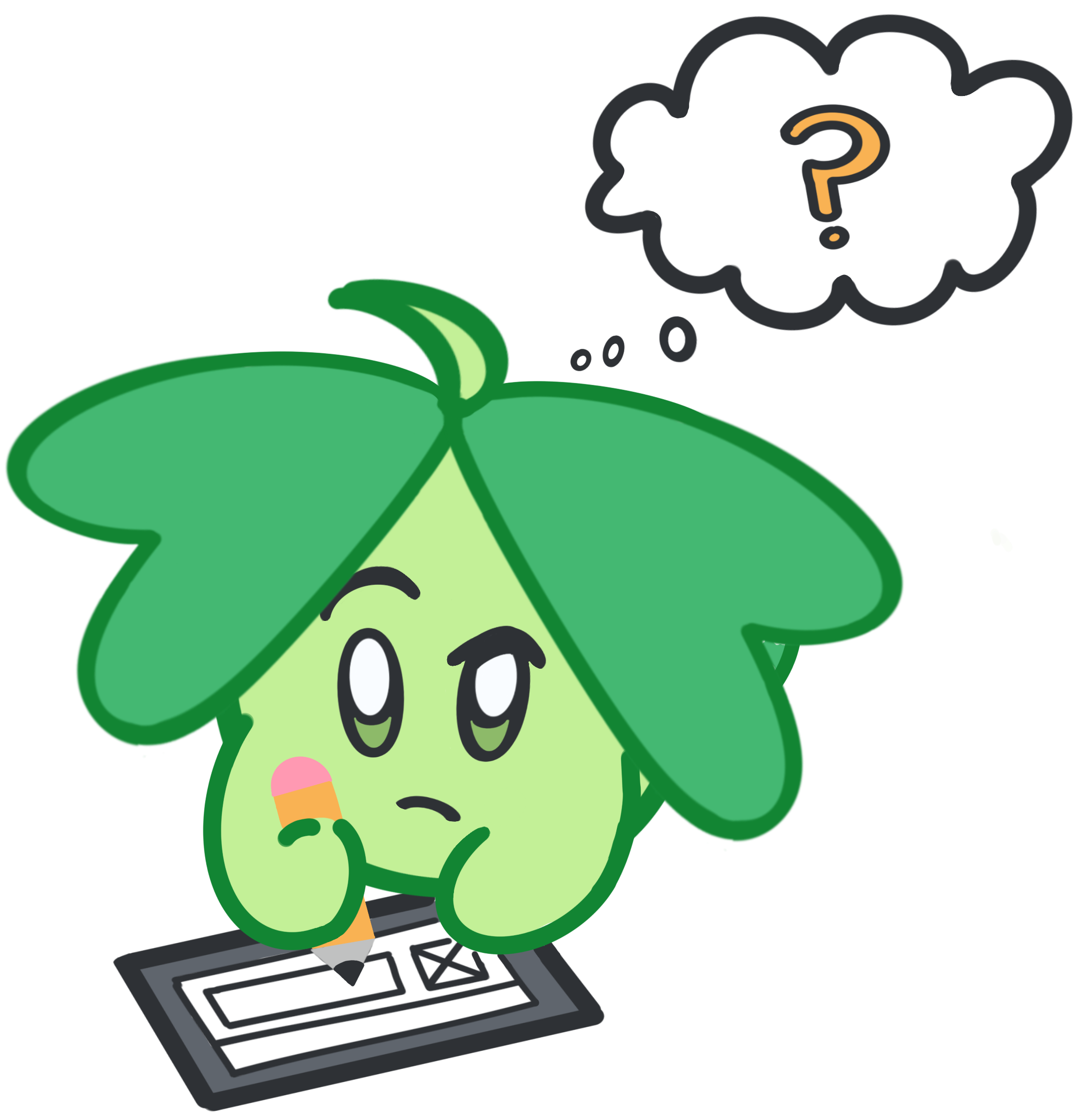
Part 2: Concepting
Keeping in mind the user profile and problem statement, I began visualizing the features and functions that could deliver the best solution for the users.
User Flow
As I drew User Flows, I visualized the happy path and the alternative paths they might follow as the users complete their tasks. As a result, I get a complete picture of all the possible ways a user can take, allowing me to capture that in the wireframes. I also understood various hiccups that could be simplified or eliminated and included this in my wireframes.


Swipe to see the other user flow
Information Architecture
Drawing from my learnings from the user flows, I quickly sketched out the site architecture of my website to build a starting point. Since there were various pathways, I used a Co-Existing Hierarchy to allow overlapping information.
First Site Map

First Card Sorting
I created a Card Sorting Test to ensure that the IA was aligned with how my users associated words and organized categories. Harnessing OptimalSort, I conducted card sorting with an open technique with 6 different users from both target audiences, Greta and Regina. Below are results in the similarity matrix.
Learnings:
The average time to complete the test was nine minutes, and most users didn't correctly place the labels in the correct category. It indicated that the users were confused and I needed to revamp my sitemap:
Flow 1: Condensed "Reduce", "Reuse", and "Replace" into "Search Results" to simplify it.
Flow 2: Added "Eco-Database, a new category, to increase accessibility to searching items, and added lower tiers.
Flow 1 & 2: Combined both paths to provide users with more ways of accessing "Preview Material", and restructured the lower tiers
Flow 3: Eliminated "Profile", as I realized it wasn't a testing priority. Added "My Eco-Impact", a new category, which included all the screens related to the user’s ecological footprint.
Open Technique proved to be too complicated for the user. Hence, I designed another card sorting test but with the closed technique.
Second Site Map

Second Card Sorting
I conducted a card sorting test with the closed technique for simplicity’s sake. I tested the second re-iteration of the site map with 9 participants and analyzed it using the popular placement matrix.
Learnings:
Flow 1 & 2: Users found the sitemap straightforward, as it took participants an average of five minutes to complete this test, and most of them matched the label with the correct category. As the purple highlight indicated, users understood that both paths were associated with the same destination.
Flow 1 & 2: To clarify the confusion indicated by the red highlight, I combined “Negative Impact and “Positive Impact” as “Material’s EcoImpact”.
Overall: Renamed the labels to increase the clarity of the functions.
Quick Survey
I wondered if this sitemap appeared encouraging enough for the users, so I conducted a brief survey with the same participants.

Learnings:
Four users who identified as Greta stated that this sitemap would encourage them due to their intrinsic motivation
Five users who identified as Regina stated that this sitemap encouraged them, due to their need for extrinsic motivation
Learnings:
Five users who identified as Regina stated that earning rewards would be the best extrinsic motivator that would motivate them
Final Site Map
Combining everything I learned, I designed this final site map to include the insights I gained.

Key Insights
Added “EcoRewards" for users like Regina to be extrinsically motivated by earning rewards like cookies.
Increased ways of finding and previewing materials by adding the option to scan materials, search by keyword, or through Eco-Database
Added "My Eco-Impact Score" to every screen related to the user's impact.
Eliminated “Profile” as it isn’t a testing priority.
Wireframing
Following the site map, I rapidly designed wireframes for all my key features, from low-fidelity sketches to high-fidelity prototypes.
Wireframing became crucial in visualizing the user flow and content, and assigning appropriate screen space based on the information hierarchy. For brevity's sake, I featured the most crucial user flow below to showcase the progression of levels of fidelity.
User Flow: Find the Impact of Recycling

Low Fidelity Wireframes
Harnessing the creative power of pencil and paper, I rapidly generated rough sketches consisting of the essential elements required for the functionality of the features. I explored different ways of placing Regina's required features (sorting tabs, section of Impact Preview anthe d bookmarks) and Greta's essential features (EcoImpact Screen and Material’s Impact section).


Swipe to see the version without comments
Mid Fidelity Wireframes
Transitioning from paper to digital, I added the details required to test the functions of the basic features and the user flow. To make this functional, I transformed the squiggly lines into cards, shapes into icons, added required screens to allow it to scan, and added CTA buttons. Below features the critical changes I transformed.


Swipe to see the version without comments
Part 3: Prototyping & Testing
Before refining the product into a High Fidelity, I stepped back to identify and correct any glitches faced by the user.
Hence, I transformed the Mid-Fidelity Wireframe into a prototype and conducted two tests, Usability Test and Preference Test.
Usability Testing
I conducted a Usability Test to ensure that my users can achieve their goals and to gather the data required to refine it to High Fidelity level.
Before conducting the test, I prepared a test plan consisting of a testing script, methodology, and participants' demographics.
Goals
Following the UX Hierarchy of Needs, the goals were to assess the functionality and usability of this Mid-Fidelity prototype. I aimed to observe and measure whether users can navigate around the site, use the intended function, and whether they find that function useful.
Scope:
Test 4 user flows by asking the participants to do the follow tasks:
Create an account
Search for the materials and find information
Navigate and use EcoImpact
Navigate and use EcoReward
Participants
The study recruited six diverse participants, three participants following the persona of Greta and three participants following the persona of Regina.
Affinity Maps
After conducting the Usability Test, I gathered, sorted and grouped insights, comments and observations into overarching themes to determine the user’s perspective and usability issues.


Pain Point Prioritization
I laid out the key themes of the Affinity Map into the Rainbow Spreadsheet to gauge the frequency and severity of critical issues.
I totalled the times the participants identified with the key themes, which validated the importance of features and prioritized usability errors.
Key Insights
After analyzing the usability results, the following assumptions were validated:
1) Users searched using many methods, such as visual search, keywords and categories.
2) Greta users and Regina users preferred different features:
Greta users enjoyed a detailed breakdown of the impact of their behaviour.
Regina users liked getting rewarded for being eco-friendly.
Regina users appreciated features that saved time, like the sorting tabs, auto search suggestions and the customization process.
Regina users enjoyed the scanning feature since they needed clarification on the components of the materials they were recycling.
Issues and Resolutions
However, the Rainbow Spreadsheet identified and privatized the top 5 issues that required corrections:
Issue 1: High Severity
The wording could be more precise, including the CTA, instructions and copywriting.
Solution:
1) Replace copywriting with more straightforward terms.
2) Make CTA buttons more precise.
3) Add pop-ups that explain features when needed.


Issue 2: High Severity
Some elements on the screen were not perceived to be clickable.
Solution:
1) Information boxes should have an arrow to indicate that they could be opened.
2) Bookmarks should be in two states in the prototype, default and active.
3) Selection choices should be in two states, default and active.
Issue 3: (High Severity)
Users found that the search flow was inefficient.
Solution:
1) Deleted large logo to utilize space.
2) Condense all the search methods, including categories, keywords and scanner, into one page to make it accessible.
3) I replaced it with the "saved search" section, instead of the Eco Database having its section.
4) Since no one is using voice recognition, I replaced it with the camera icon to make the scanner feature accessible.


Issue 4: Moderate Severity
Users needed to learn the gist of Ecofy or the existence of the features at first glance.
Solution:
Provide a brief onboarding at the beginning of the process.

Issue 5: Moderate Severity
While the scanning feature is valued, it is too complicated for users to use.
Solution:
Simplify the process and add an instruction section.

Preference Testing
After updating my prototype, there were a few layouts that I debated. I conducted a Preference Test to allow my 11 participants to decide.
Question 1: Which design do you prefer?

Results: The participants preferred variation B due to the "tangible, meaningful images" and "specific details, making it "easier to relate to my actions", whereas Variation A's image lacked meaning.
Question 2: Which design do you prefer?

Results: Variation A was prevalent among participants, stating that this version was "clearer, decluttered, and easier to understand", whereas Variation B was "too confusing" due to their need to click on the pop-up explanation.
Key Insights
Users validated that they appreciated the core features of Ecofy, such as multiple ways of searching, calculation of ecological impact, and rewards.
User Testing spotlighted key issues regarding confusion, complication and clarity of features, which I reiterated and corrected.

Part 4: UI Design
After ensuring that my prototype was functional and correcting usability issues, I applied UI elements, including Visual Design Principles and Emotional Design Principles, to design a High-Fidelity Prototype. I created Design Language System to ensure UI and UX consistency as it is handed over to colleagues.
Visual Principles
I refined the screens with Visual Principles, such as the Law of Good Form and Common Fate. Below featured the main screen of Flow 1 that change the most.
Screen 1:

Screen 2:

Emotional Design
Ecofy aspires to make being eco-friendly fun rather than a tedious chore. Hence we harnessed Emotional Design Strategies to gamify the design and embody a fun brand personality.
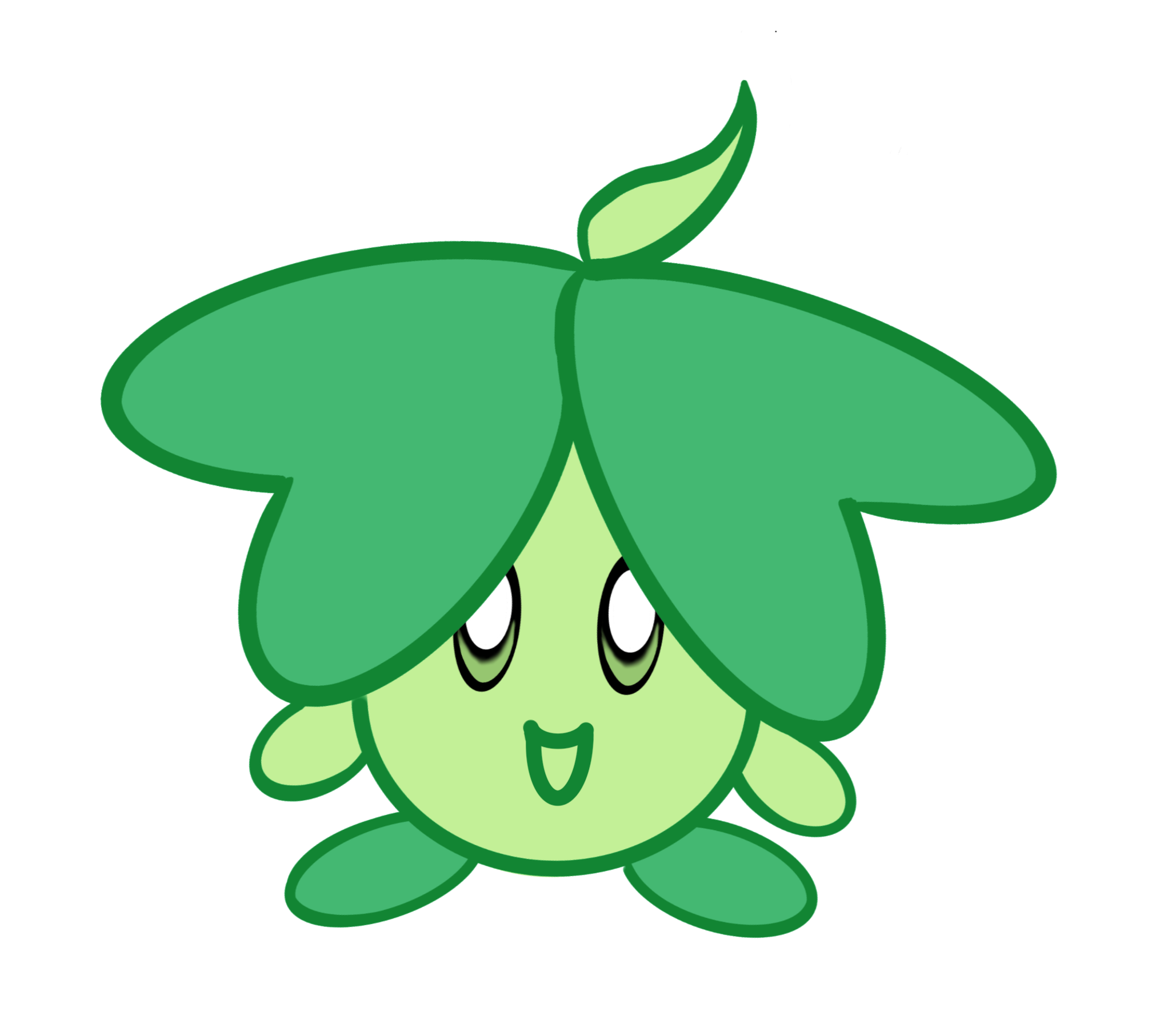
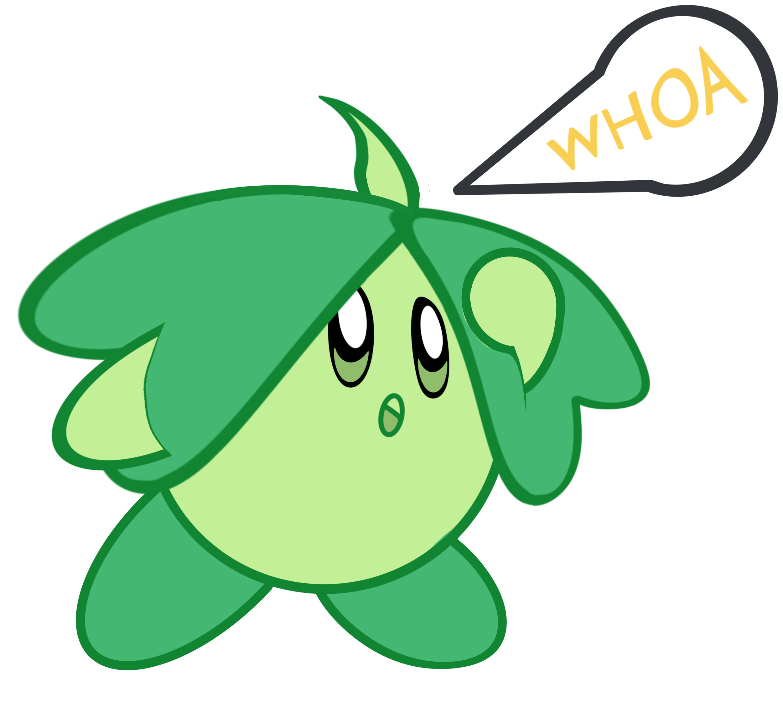
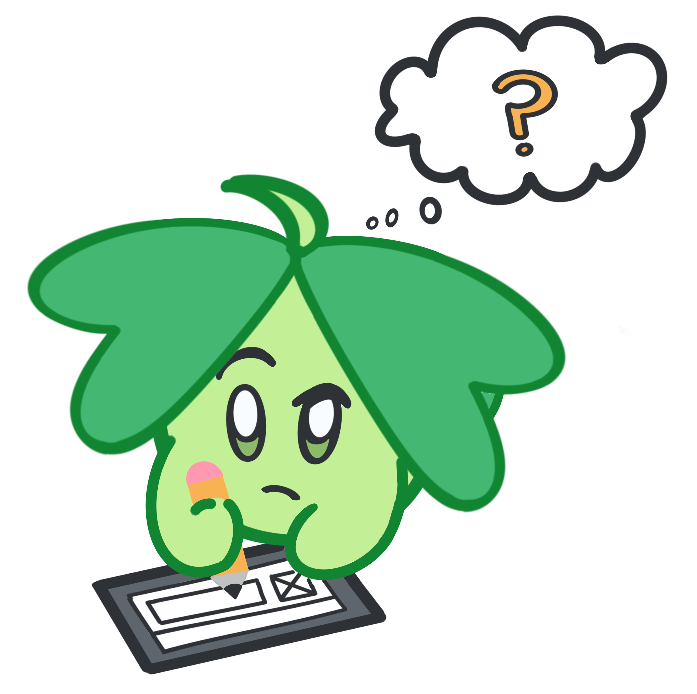
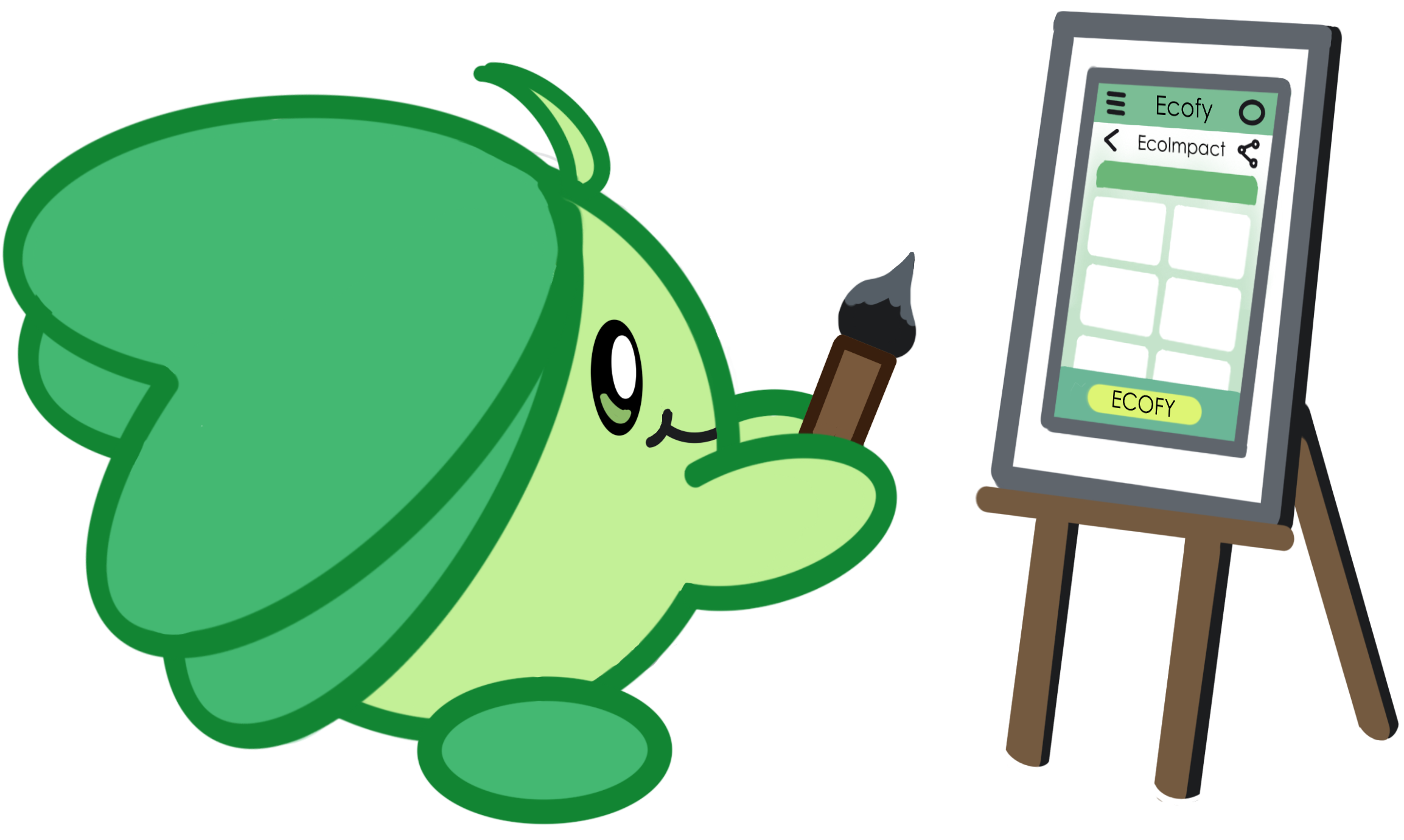
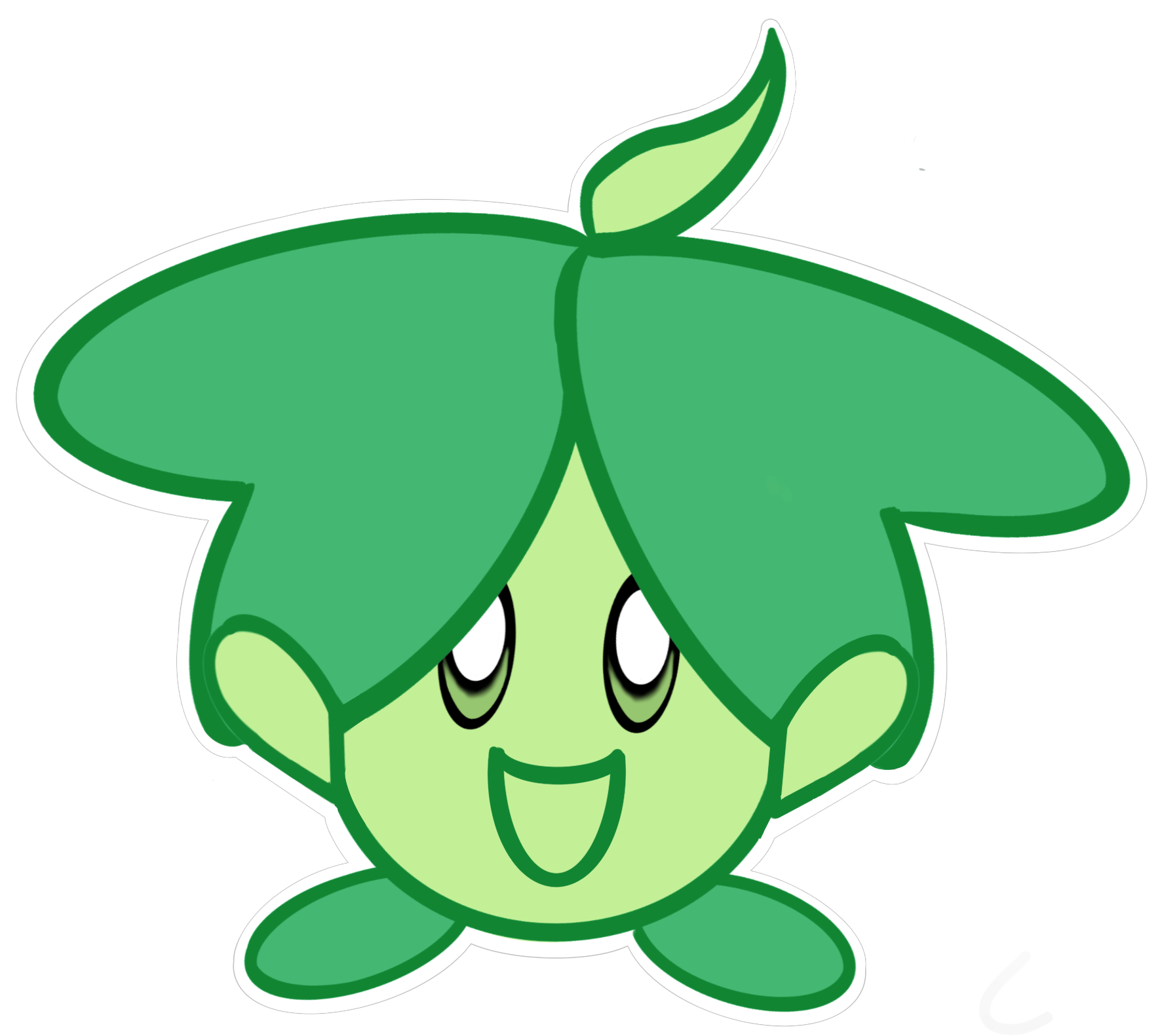
Strategy 1: Mascot and Icons
To design a memorable impression on the visceral level, I created a mascot to represent Ecofy's brand personality, which is fun and eco-friendly. Eco, the mascot, has a cute circular face to provoke warmth and cheerfulness and is covered in green leaves to embody the environment. Furthermore, to add to the fun, I drew these cute icons.


Strategy 2: Animation
To design Ecofy to be interactive, I animated Eco to represent users' choices. Eco featured a range of emotions to positively or negatively reinforce the user's choice. For example, users get rewarded with this cheerful pop-up when they complete an eco-friendly task.

Strategy 3: Colour Palette
To embody the fun and eco-friendly brand personality, I selected these playful green colours and colour gradients to give that impression.

High Fidelity Wireframe
After many refinements, I reiterated my wireframes to the level of the High Fidelity in including the testing results and UI elements.


Swipe to see version without comments
High Fidelity & Prototype
After investing hard work, I animated my wireframes into my final prototype.
Style Guide
To ensure that the UX and UI design are consistent throughout the product development process, I established a Style Guide. It includes thorough documentation of the product logo, color palette, typography, component library, imagery, and iconology, with guides on how to use and grow this design direction. This document allows designers to reuse these elements and scale the product, as well as developers to build compatible screens.


Swipe to see more of Style Guide
Part 5: Lessons Learned
Through the ups and downs, I finally finished this journey and learned a lot during this roller coaster ride. The following features the highlights of journey and lessons I learned to apply next time.
Journey’s Highlights
Despite the required hard work this project demanded, I relished the journey to complete this project. Some of the highlights were:
1) The thrill of discovering and designing to fill in the gap. The inherent problem solver in me loves stumbling upon the puzzle and brainstorming ways to put the puzzle pieces together.
2) Listening to the users, not my assumptions. As an environmental activist, I made several assumptions based on my experience. I am glad I identified my thoughts as assumptions, not facts, and instead tested my hypotheses and listened to the users. While some of my beliefs were incorrect, I made several wrong assumptions that could have led me wrong if I didn't listen to the users.
3) Finding the gap in the market. After analyzing and positioning Ecofy in the environmental market, I realized that the industry was missing a website that provided awareness, education, and rewards. The users also validated this, confirming that an actual target audience appreciates this website, not hypothesized personas.
4) Designing this project heightened my passion for the visual arts. I enjoyed the creativity behind designing the UI elements and drawing my icons and mascots. I also cherished using my imagination to have a practical application of fulfilling the needs of the user.
Improvements for Next Time
During this roller coast journey, I made a couple of mistakes that I learned and will implement next time.
1) Conduct a mini run-through of tests before implementing them. Due to using technique and unclear questions, my users were confused, and I had to redo my card sorting tests. Next time to ensure that the tests are correct, I will go through them with a user to ensure that the test questions and techniques can test the intended features.
2) Don't fixate on the small details. As a detail-oriented person, I focused on fixing and iterating small elements, which took longer than required. I constantly had to remind myself, "better done than perfect", to let go of my need for perfection.
3) More diverse peer feedback. While I had a few UX designers provide feedback, I would like input from different disciplines, like Website Developers, Environment Scientists and Business Consultants, to have different perspectives on improving Ecofy.
Thank You
I hope you enjoyed following my journey as much as I enjoyed it. If you want to see more of my work, please see my other projects.